
Data visualization is a general term that describes any process that converts data sources into a visual representation such as charts, graphs, maps, and tables. There are three main categories:
A good data visualization can uncover (exploratory visualization) and communicate (explanatory visualization) relationships and patterns otherwise hidden in your data.
A well-designed visualization is easier to remember than a table of numbers. The visual impact of the Income in Canada infographic is easier to recall than if one were to simple read numbers from a table.

Figure 1: Income in Canada Infographic to show how data can be presented in a visualization.
Statistics Canada. (2016). Income in Canada, 2016 Census of Population. Retrieved on January 16, 2018.
Open Government Licence – Canada
Anscombe’s Quartet shows how four datasets with identical summary statistics, when displayed on a scatter plot reveal four distinct patterns. By visualizing the same sets of data it is clear that the data is in fact different. Some insights can only be discovered visually.
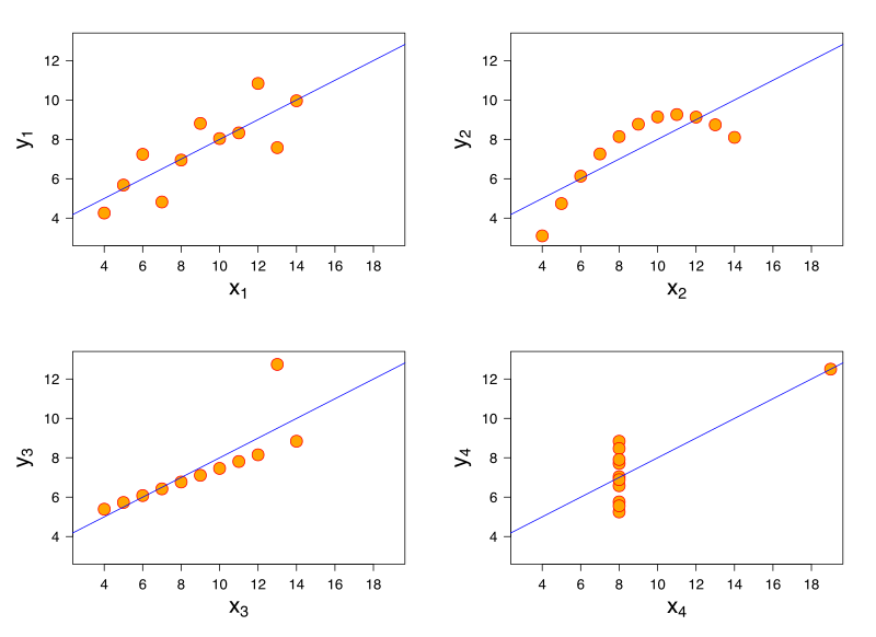 Figure 2: Four datasets defined by Francis Anscombe for which some of the usual statistical properties (mean, variance, correlation and regression line) are the same, even though the datasets are different.
Shultz. (2010). Anscombes Quartet. Retrieved on January 16, 2018.
CC BY-SA 3.0
They enable us to make sense of information that would be otherwise impossible to understand. For example, See the visualization of flight patterns in the US by Aaron Koblin, part of the Celestial Mechanics project at UCLA.

Figure 3: Screen capture of the paths of air traffic over North America.
Koblin, Aaron. (2015, July 2). Flight Patterns. Retrieved January 16, 2018.
CC BY

This work is licensed under a Creative Commons Attribution-NonCommercial-ShareAlike 4.0 International License.